Expert Voices: Oliver Barker on Gerhard Richter’s 4096 Farben


“I had made smaller Color Charts during the 1960s, which I did not feel were as successful as the later series, which are so strong and suggestive that it makes it difficult for them to be shown alongside other paintings. I made one painting with over four thousand color boxes, directly abutting one another in a quite impressionistic way, but with each color repeated four t.mes s. I hoped with my Color Charts to retain a picture which stood up on its own."
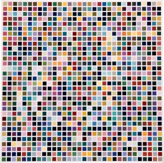
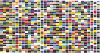
Turquoise, pink, chartreuse, alabaster, periwinkle, moss, and four thousand ninety more: one after the other, each pigment glimmers from the monumental lacquer surface of 4096 Farben as Gerhard Richter deftly refines painting to its simplest and yet most evocative form: color. Executed in 1974, 4096 Farben emerges as the singular milestone and ultimate destination of Richter’s pivotal Color Chart paintings, which stand among the most significant conceptual breakthroughs in not only the artist’s legendary career, but also the tradition of painting within the last century. In this final painting of the series, Richter multiplies each color within his palette fourfold, resulting in the most amount of quadrants he ever arranged in a Color Chart painting at this point and arriving at the moment of visual entropy situated at the threshold between image and abstraction. 4096 Farben also sees Richter valiantly collapse the white margins that had separated the squares of individual color in earlier 1024 Farben paintings, resulting in a triumphant masterpiece in which “each color adapts marvelously to whichever other color is used.” (The artist cited in: “Interview with Irmeline Lebeer, 1973,” p. 83) 4096 Farben is one of only fourteen monumental Color Chart paintings that Richter executed in his ultimate suite from 1973-1974, the vast majority of which now belong to prestigious institutional collects ions such as the Centre Georges Pompidou, Paris and Louisiana Museum of Modern Art, Humlebæk.

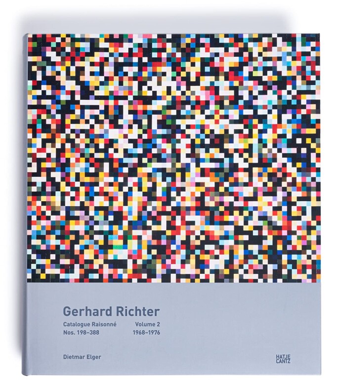
Further testifying to the landmark significance of 4096 Farben, Richter would later return to and expand upon it over three decades later in 2007 with 4900 Farben, now housed in the Fondation Louis Vuitton, Paris, and his celebrated stained-glass Cologne Cathedral Window commission in 2007, which he designed by directly referencing its chromaticity and which stands today as amongst Richter’s most ambitious and significant commissions and projects. Representing the ultimate epit.mes of Gerhard Richter’s lifelong abstractionist interrogation, 4096 Farben is illustrated on the cover of the Catalogue Raisonné for the artist, and has been exhibited as a centerpiece in many of his most significant museum exhibitions – including Gerhard Richter: Paintings at Art Gallery of Ontario, Museum of Contemporary Art Chicago, and San Francisco Museum of Modern Art from 1988-1989; and Gerhard Richter: Panorama at Tate Modern, London, Neue Nationalgalerie, Berlin, and Centre Georges Pompidou, Paris from 2011-2012. Previously held in the esteemed collects ion of Jerry and Emily Spiegel, New York, 4096 Farben has resided in the same private collects ion for nearly twenty years since.


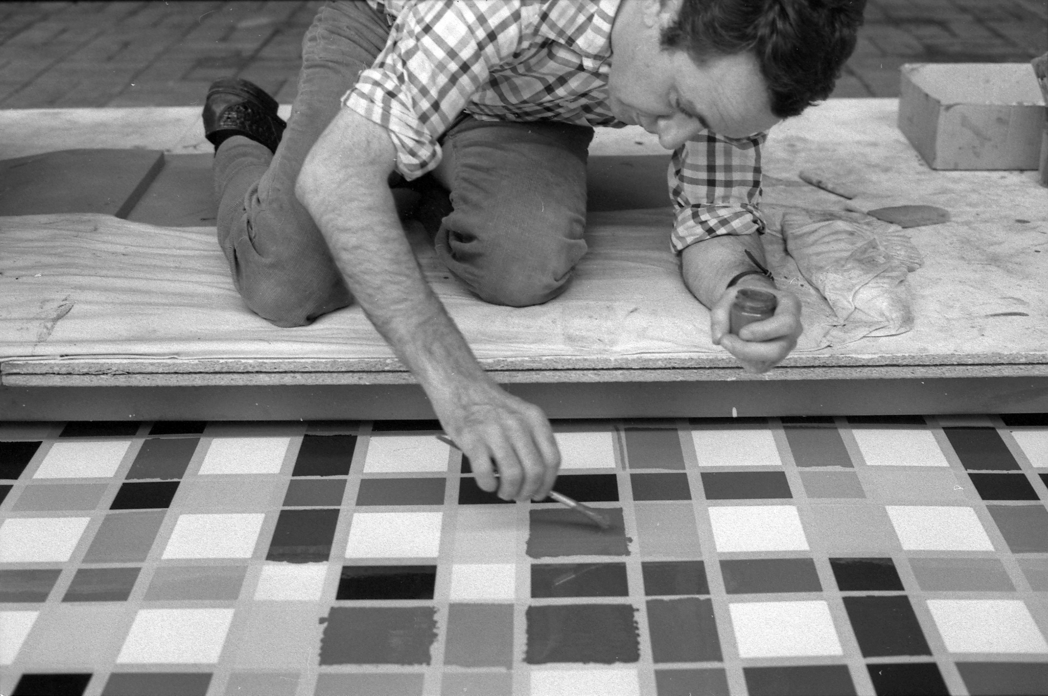
Richter began the Color Chart paintings in 1966 when, happening upon color samples at a commercial paint store in Dusseldorf, he was struck by the pictorial and categorical, indeed almost “readymade” quality, of the cards, recalling: “I went to a paint shop (in Dusseldorf) to purchase something, here I saw the usual colour sample cards that everyone is familiar with, with crossed out colour hues from a collects ion. Suddenly I had to admit to myself, ‘You cannot do this any better! These are already perfect pictures.’” Beginning with 192 Farben, Richter’s very first Color Chart painting, he sought to replicate such aesthetic neutrality in his paintings by frankly laying down colors one after the other. The Color Charts represent a dramatic step in the development of Richter’s painterly practice towards abstraction and represent the very first t.mes (with the exception of Ema (Nude on a Staircase)) that Richter introduced color into his paintings. Radically departing from the monochrome Photo Paintings which Richter had been producing previously, the Color Charts limited the representative function of the image and instead turned to the fundamental elements of a picture – color and structure – freed from any narrative function.
Monumental Color Chart Paintings from 1973-1974 in Institutional collects ions


“In order to be able to represent all extant color shades in one painting, I worked out a system which - starting with the three primaries plus gray - made possible a continual subdivision (differentiation) through equal gradations. 4 x 4 = 16 x 4 = 64 x 4 = 256 x 4 = 1024. The multiplier 4 was necessary because I wanted to keep the image size, the [size of each field], and the number of [fields] in a constant proportion to each other. The arrangement of the colours on the squares was done by a random process, to obtain a diffuse, undifferentiated overall effect, combined with stimulating detail. The rigid grid precludes the generation of figurations, although with an effort these can be detected. This aspect of artificial naturalism fascinates me – as does the fact that, if I had painted all the possible permutations, light would have taken more than 400 billion years to travel from the first painting to the last.”
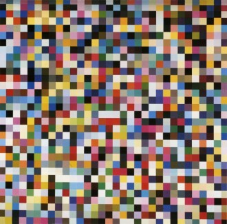
4096 Farben punctuates the finality of nearly a decade of radical experimentation between 1966 and 1974, during which Gerhard Richter executed three discrete series of Color Chart paintings that each progressed in complexity with the evolution of his conceptual enterprise. Richter’s inaugural Color Chart series – begun with 192 Farben – reflected the ready-made quality of industrial paint charts while maintaining an irreverent Pop Art rejection against the lofty ideals of his Color Theorist contemporaries; as the artist admitted, he intended to extend a defiant “assault on the falsity and religiosity of the way people glorified abstraction, with such phony reverence. Devotional art – all those Church handicrafts” (Gerhard Richter cited in: Hans-Ulrich Obrist, Ed., Gerhard Richter: The Daily Practice of Painting, London 1995, p. 41). By 1971, Richter abandoned the structure of a traditional paint chart in his second series of Color Charts, instead exploring a mechanically progressive series of grids to contain each cell of color. In this new painterly algorithm, Richter calculated a mathematical system for mixing primary colors in graduating amounts, resulting in a palette of manifold distinct hues that he would then order at random into the gridded framework of the composition: “In order to be able to represent all extant color shades in one painting, I worked out a system which - starting with the three primaries plus gray - made possible a continual subdivision (differentiation) through equal gradations. 4 x 4 = 16 x 4 = 64 x 4 = 256 x 4 = 1024. The multiplier 4 was necessary because I wanted to keep the image size, the [size of each field], and the number of [fields] in a constant proportion to each other.” (Ibid, pp. 81-82)

Sotheby’s Spotlight: Mark Godfrey on Three Masterworks by Gerhard Richter


As the pinnacle of this conceptual project, 4096 Farben belongs to Richter’s third and most ambitious series of Color Charts, which occupied his practice between 1973 and 1974. In these works, the artist at last introduces the nuanced hues of light gray, dark gray, and green into his primary palette; in doing so, Richter multiplies the colors of his previous Color Chart paintings fourfold, resulting in 1024 distinct hues that, once collided, generate the exponentially greater spectrum of polychroma that unfolds in the present work. As the only Color Chart painting in which Richter replicates each color four t.mes s, 4096 Farben represents the quintessential ultimatum of the intellectual and aesthetic inquiry behind his Color Chart paintings: here, he arrives at the maximum number of color combinations before the difference between one hue to another become imperceptible to the human eye. On this ultimate development of his Color Chart paintings, Richter admits, “I had made smaller Color Charts during the 1960s, which I did not feel were as successful as the later series, which are so strong and suggestive that it makes it difficult for them to be shown alongside other paintings.” Speaking to the supremacy of the present work instead, he continues, “I made one painting with over four thousand color boxes, directly abutting one another in a quite impressionistic way, but with each color repeated four t.mes s. I hoped with my Color Charts to retain a picture which stood up on its own." (The artist cited in: Exh. Cat., Gerhard Richter, London 1991, p. 128). Richter would later return to concepts introduced with the Color Chart paintings in 2007 with 4900 Farben, (Fondation Louis Vuitton, Paris), and, most notably, with his celebrated stained-glass commission for the Cologne Cathedral’s south transept window, the design of which is based directly on 4096 Farben. Composed of 11,500 squares of glass in 72 different colors, the Cologne Cathedral Window represents a triumphant achievement and awe-inspiring constellation of color, as light refracted through the stained-glass disperses into a dazzling array of color, dramatically variegated across a monument expanse of individual quadrants.

Advancing a critical development in the artist’s exploration of color and his departure from narrative form during the 1960s and 1970s, Gerhard Richter’s final Color Chart paintings mark a seminal moment in his career during which he integrates nonobjectivity with abstraction, seriality with chance. In 4096 Farben, Richter reaches a level of technical perfection in his use of lacquer paint, eradicating the hand-crafted irregularities that remained visible in earlier series. Above all else, by tabulating colors into an organized matrix, Richter dispels the art historical glorification of creative freedom and expression and instead abides by the order and precision of a predetermined pictorial structure. Richter’s serial organization of 4096 Farben extends foundational principles of grid structures developed by artists like Piet Mondrian, Josef Albers, and Man Ray in the early decades of the twentieth century, while his randomized arrangement of colors radically introduces into his canvas the law of chance. Richter’s preoccupation with arrangements of color, whether random or mathematical, also calls to mind Ellsworth Kelly's Spectrum series; both artists were concerned with color as form, abandoning the traditional use of color as representational. Richter’s determination for indeterminacy itself is nowhere better expressed than in his randomized placement of colors within the mechanical array of 4096 Farben. In this non-hierarchical arrangement, he entirely liberates and simplifies each color to its absolute essence with the present work; no longer bound by the forms which they pigment, the colors pulsate and come alive with an energy of their own, becoming form itself.


"When a viewer attempts to register it visually, the work is experienced as the manifestation of an abundance that cannot be contained in language…It demands too much of the viewer, because the visual complexity of the chaotic structure exceeds the eye’s ability to adapt.”
As Richter’s most important homage to the rigors of Minimalism, the Color Chart paintings occupy a pivotal midpoint between the polarities of his monochrome Photo Paintings and his revolutionary transition into ultimate painterly abstraction by the late 1970s. In this context, they find close alignment with Richter’s Grey Paintings and Clouds, occupying a crucial step within Richter’s conceptual exploration of anti-painting and chance. While Richter began his series of Grey Paintings concurrently with the Color Charts beginning in 1968, it is notable that upon completing the Color Chart series, culminating in 4096 Farben as his most conceptually rigorous, ambitious and exhaustive exercise in color, Richter subsequently turned away from color entirely and to an intensive body of Grey abstracts, as if having temporarily exhausted the capacities for color in his work.

Mark Godfrey: Gerhard Richter - Panorama (2011)


Richter’s Color Chart paintings comprise a watershed corpus within his oeuvre because they replace the soft grays and blurred delineations emblematic of his earlier paintings with bold colors that are uncompromised by texture or complexity, altogether creating final images that are thoroughly abstracted in their pixelation. Aiming to encapsulate all possibilities of color within a singular painting, in 4096 Farben, Richter unveils a dizzying overabundance of mixed tones, one that draws prescient foreshadowing to the pixelation process adopted in computer graphics to construct digital images. In the mosaic-like surface of the present work, Richter thus unfolds the optical possibilities that a picture plane can achieve beyond the confines of painterly expressiveness or subjectivity: quadrants of pure color contrast and vie with each other for a spectator’s attention, yet ultimately dissolve and disappear before one’s eye when seen from afar. As Hubertus Butin notes, “The chaos rules out the possibility of grasping the painting as a whole in terms of its coloristic determination. When a viewer attempts to register it visually, the work is experienced as the manifestation of an abundance that cannot be contained in language…It demands too much of the viewer, because the visual complexity of the chaotic structure exceeds the eye’s ability to adapt.” (Hubertus Butin, “Gerhard Richter’s Color Charts of the 1960s and 1970s” in Exh. Cat., Dominique Levy, Gerhard Richter: Colour Charts, London 2015-2016, p. 23) Evincing the most extreme level at which Richter abstracts painting in this series, the supreme visual illusion of 4096 Farben announces the radicalism at the crux of not only his limited Color Chart paintings, but also his legendary painterly enterprise at large.

“If the color in the stained-glass construction rehearses all the chromatic options of color`s archaic links to light and luminosity, to transparency and transcendentality, and to luminous or chromatic projections into space, then the painted complement, in its tightly organized accumulation of color squares in aleatory arrangements and multiple potential permutations, does exactly the opposite, emphasizing deep saturation and opacity, immaculate industrial perfection of production, and the perfect petrifaction of color as an element of a lifeless, denatured culture of administration and design.”
Assembled in a monumental, square grid and yet arranged by chance, Richter’s prismatic kaleidoscope is expressed at its absolute apotheosis in the visual illusion presented by 4096 Farben: color simultaneously dissolves before the viewer’s eye while also asserting itself as an autonomous form. As Richter replicates his range of colors fourfold in 4096 Farben, he valiantly sets out to resolve the preliminary aesthetic challenge he posed for himself and to expand beyond his previously established limits for optical stimulation: “To use more than 1024 tones (4096 for example) seemed pointless since the difference between one shade and the next would no longer have been detectable.” (Gerhard Richter cited in: Hans-Ulrich Obrist, Ed., Gerhard Richter: The Daily Practice of Painting, London 1995, pp. 81-82) With the completion of the present work, he thus overturns his own thesis, revels in the omnipotence of color itself, and finally arrives at the apogee of his radical undertaking to assert the primacy of color. Resplendent and extravagant, 4096 Farben deconstructs the very mechanics of painting itself while signaling the culmination of Richter’s Color Chart experiment to herald a critical turning point in his career.


